triumph_
Quieter pages, and the same short way to the cart.
Triumph’s vision and its live shop didn’t match. We closed the gap, and kept the cart within reach.
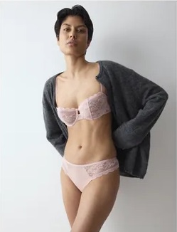
Triumph had designed a calm, editorial shop. What went live was busier: badges, sale messages and product details sat on top of the photography. A quieter shop only counts if it sells at least as well, so every change was weighed against the figures Triumph runs its shop on.
The product page
Where the decision is made. The pictures lead, and everything needed to buy stays beside them.
Made the shop quieter without making it harder to buy
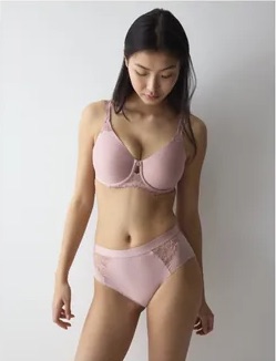
An earlier redesign had set a calm, editorial direction, and the build did not carry it. Badges and sale messages competed with the pictures.
[Designed for — conversion rate]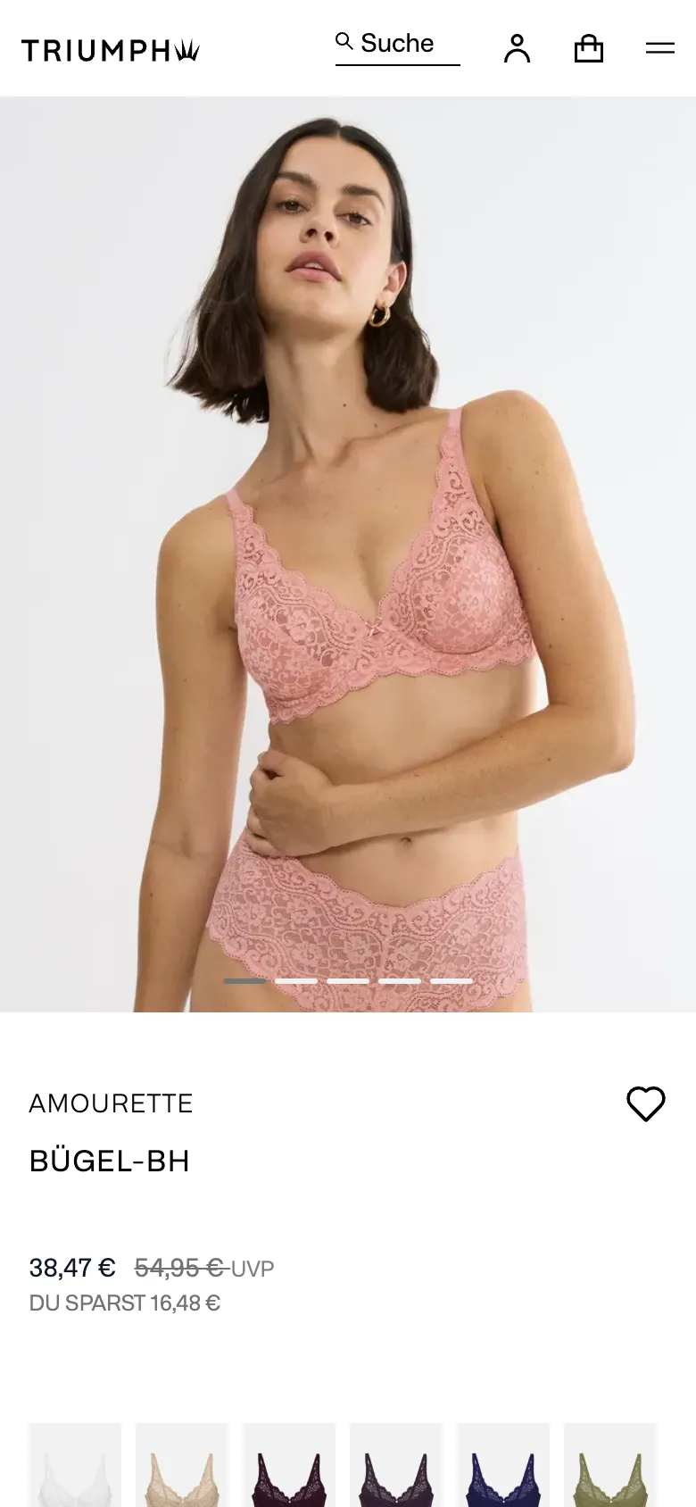
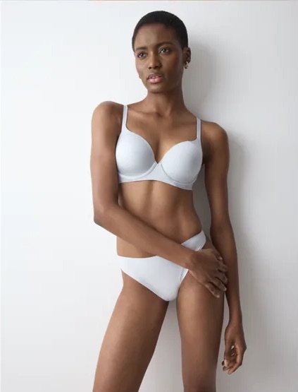
Let the photography lead
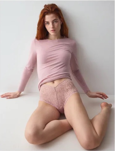
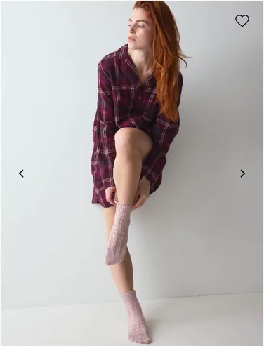
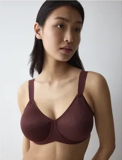
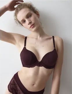
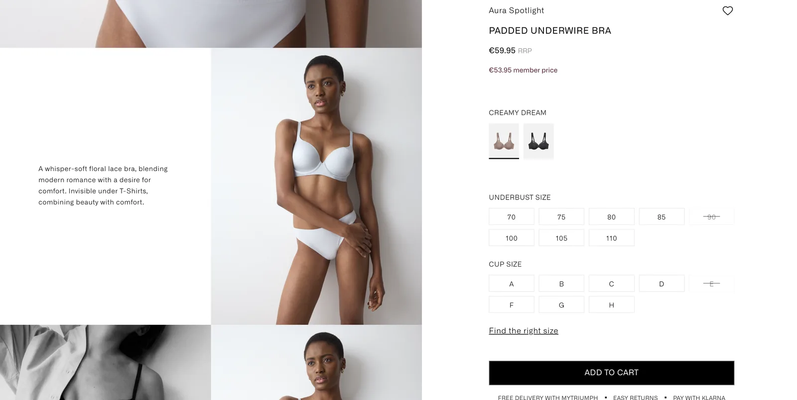
A continuous gallery runs down the product page. The buy box beside it is set in smaller, lighter type, with price, colour and size still next to the product.
[Designed for — add to cart rate]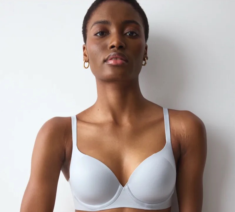
Kept the right details next to the decision
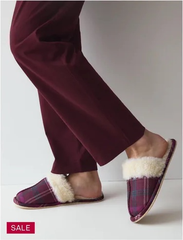
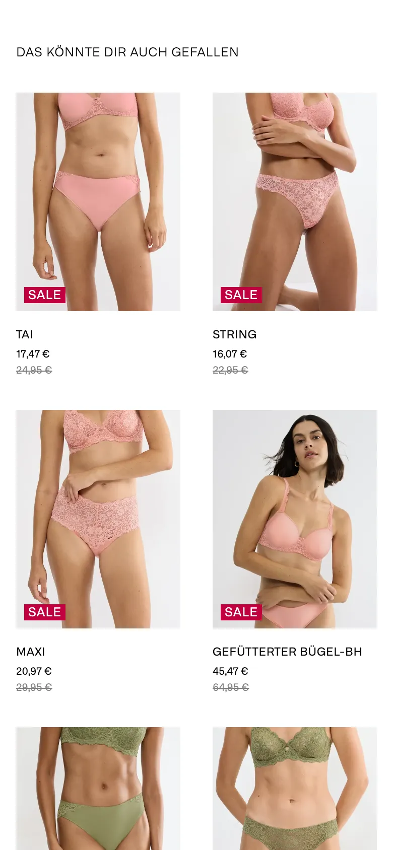
“Complete your set” sits right under the add to cart button, and materials, care and the description fold into an accordion. Further down, one grid of products replaces three carousels.
[Designed for — order value, products seen per visit]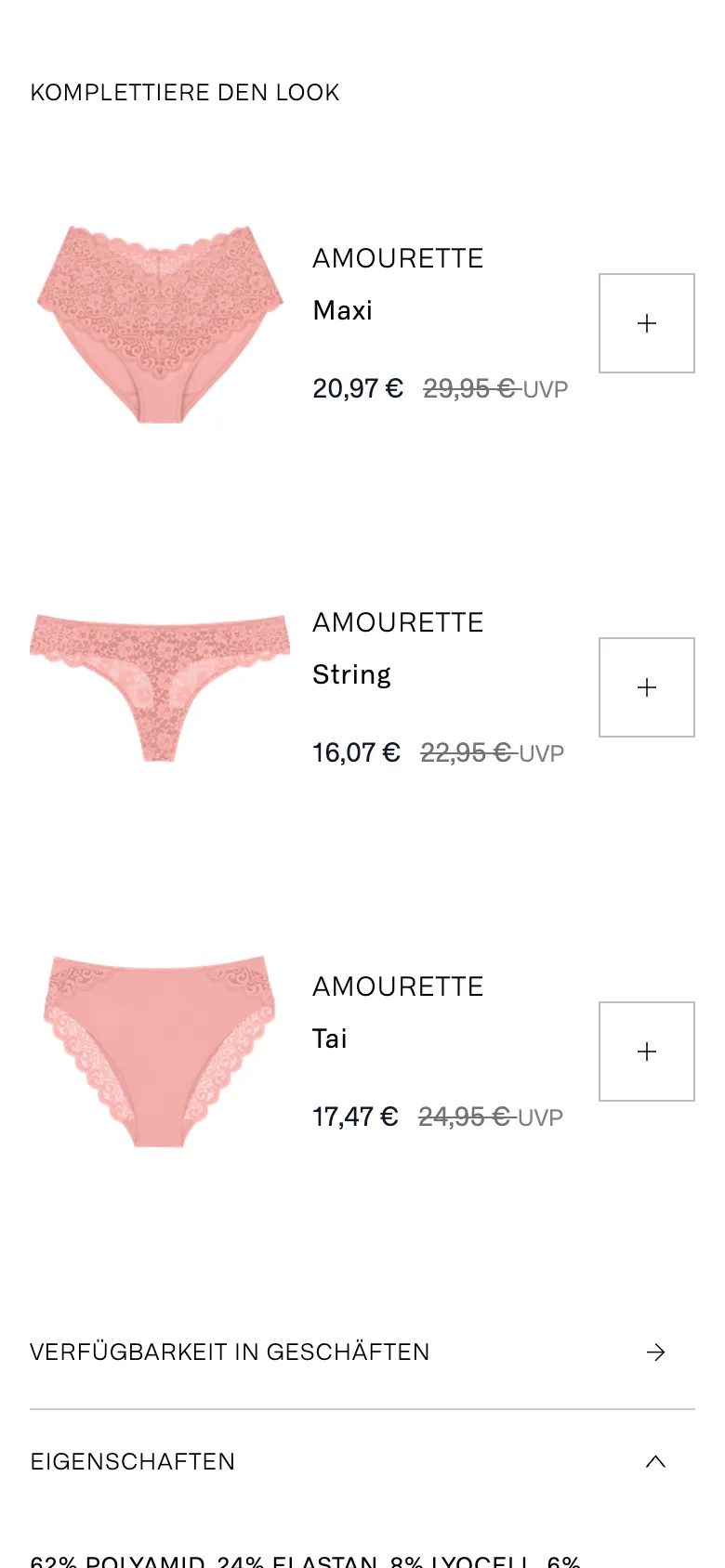
The listing page
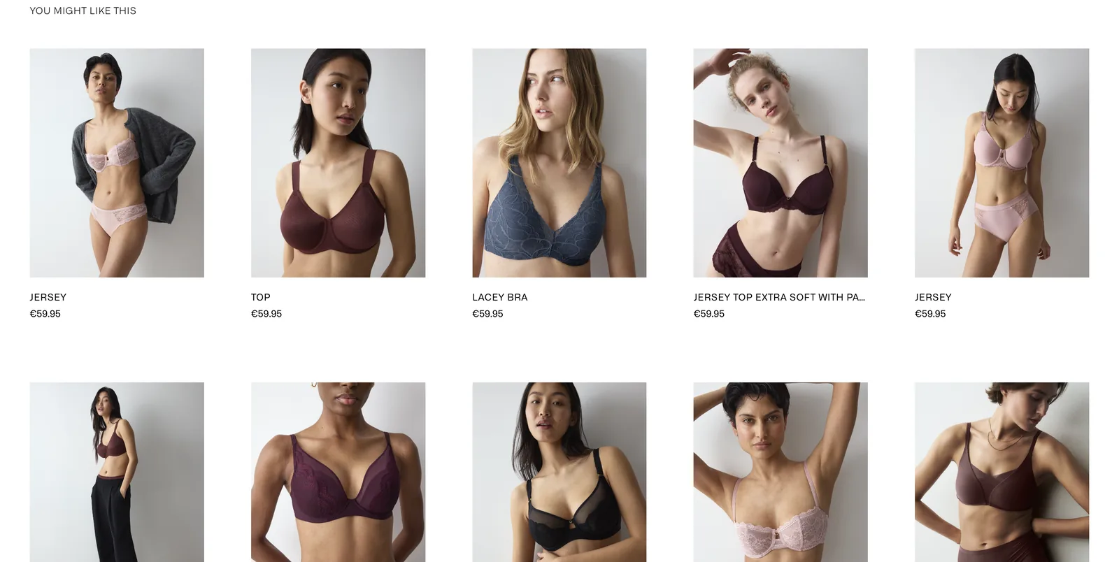
Where shoppers compare. Each card carries only what a comparison needs.
Took off what shoppers skipped
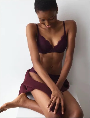
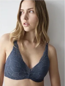
Each listing card keeps the title, the price and the colours. Badges sit in one fixed place, so a dense grid of bras is easier to scan.
[Designed for — clicks from listing to product page]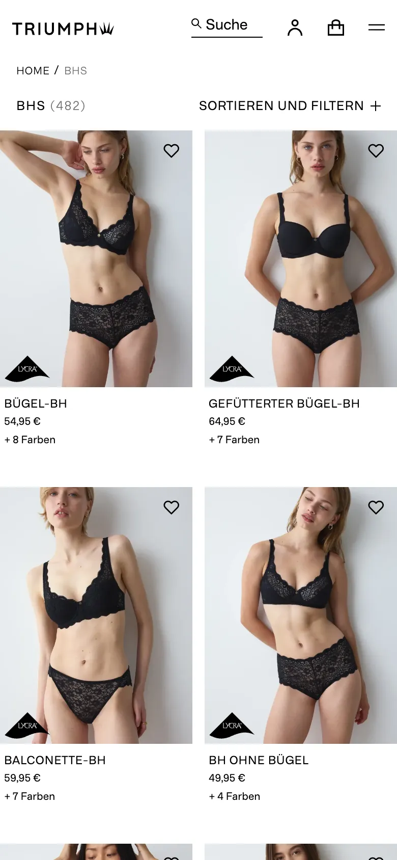
Filters that stay quiet
A collection opens under its campaign picture. The size filter sits inline above the grid, with underbust and cup size side by side. On a phone the same two sizes open together in one sheet.
[Designed for — exits from the listing page]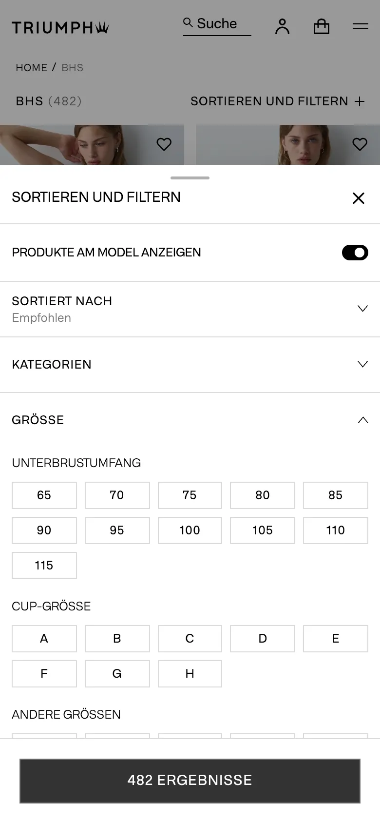
Built to be measured
Calm is how the shop should feel. It also has to sell.
Weighed every change against the numbers
The redesign went live in summer 2026. The next phase brings A/B tests and a single-page checkout, and the tests decide what stays. Until then, these are the figures each decision was made for.
- [Conversion rate]
- Price, colour, size and add to cart stay beside the pictures, so the quieter page puts nothing between a shopper and the basket.
- [Order value]
- “Complete your set” sits next to the add to cart button, where the matching brief can still join the bra.
- [Products seen per visit]
- One grid under the buy box instead of three carousels, so the end of one product page leads into the next.
- [Listing to product page]
- Cards carry the name, the price and the number of colours, with every badge in one corner, so a grid of bras is quicker to compare.
Iterated on whole pages, with AI doing the groundwork
AI took on the building, so ideas reached Triumph as whole pages that run, and a review note came back as a second round rather than a revised slide.
One review note, six new prototypes
Triumph’s review asked for more inspiration, and for the bra shown as part of an outfit. The answer was a second round of six working prototypes, each a whole page you can scroll. Two of them:
The listing page, drawn twice
Once with campaign pictures set into the grid, once as an unbroken grid of products. Both were drawn as whole pages at all six breakpoints, so the two could be compared page against page.
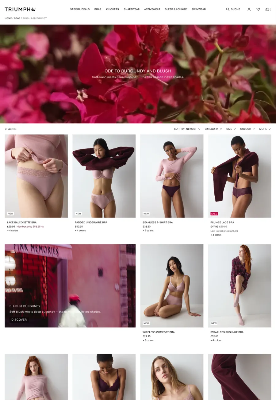
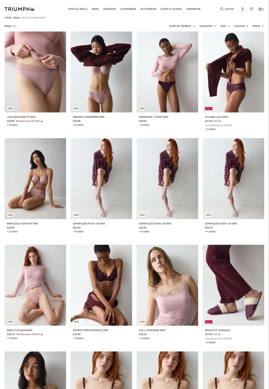
- [Whole pages]
- Each idea was built as a full page that runs in a browser, with the real photography and type. Triumph reviewed page models, scrolled and resized, rather than single screens.
- [Design language]
- Type, spacing and imagery were tried across whole pages early, in Figma and in code, so the look of the shop was settled before the details were drawn.
- [States]
- AI helped draw the cases one mock-up leaves out: sold-out sizes, names on two lines, sale prices, a bra in eight colours, six breakpoints.
- [Research and copy]
- Research was sorted with AI, and first drafts of page copy started there.
Laid the base for a design system
The direction is becoming a design system for Triumph’s main brands, and the next parts of the shop are already being designed on it.
The gallery-led product page and the cut-down listing cards, both in the shop today.
Shared by Triumph’s main brands, and growing as the work goes on.
More of the shop is being designed on the same base.
What did neverdone do for Triumph?
- neverdone designed the product page and the listing pages of triumph.com, live since summer 2026, laid the base of a design system shared by Triumph’s main brands, and checked the build against the design.
Which figures was the redesign designed for?
- Conversion rate, add to cart rate, order value, products seen per visit and clicks from the listing to the product page. The next phase brings A/B tests that measure them.
How did neverdone use AI on the Triumph project?
- To build ideas as whole pages that run in a browser, so Triumph could review page models and get a second round back after a review note. AI also helped draw the states a mock-up leaves out, sort research and draft copy. The design decisions were made by people.
Which platform does triumph.com run on?
- Salesforce Commerce Cloud.